Make or break with copy
This signup form landed on my desk with the design and development already past the point-of-no-return. Any possible improvements would have to come down to the copy. So without calling for any design or development support, I eased up the mental load of this form with a few simple but thoughtful copy changes.
Before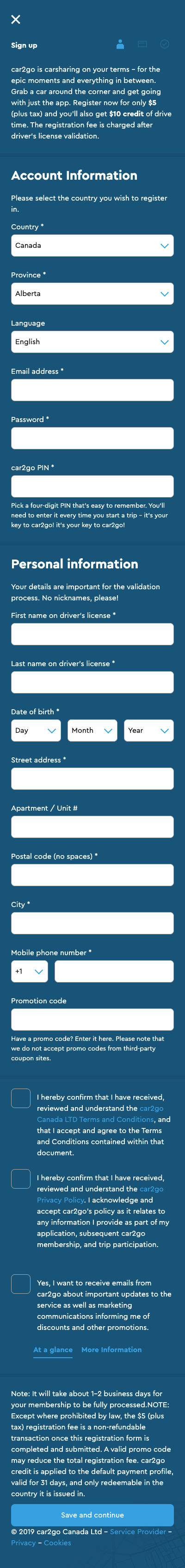
|
After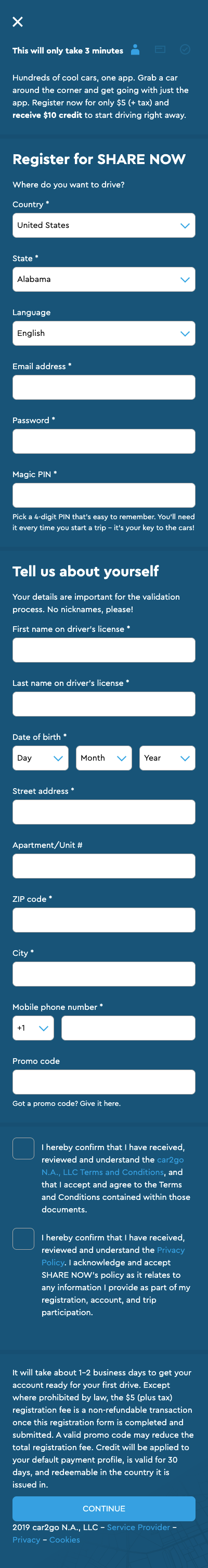
|
What changed?👈 Eased up the introduction
👈 Added brand name
👈 Shortened the form tip 👈 Tell us about yourself
👈 Shortened the form tip 👈 You can't win every battle with legal. Here I simply removed superfluity and switched the perspective of the disclaimer to the user's mindset: "to get your account ready for your first drive" instead of the passive formulation "for your membership to be fully processed." |
This page is not mobile-optimised. Sorry about that.
